When it comes to turning web visitors into leads, 68% of B2B CEO’s use strategic landing pages as part of their strategy.
A strong landing page usually offers your website’s visitors a resource, such as a piece of content, in exchange for contact information. Sharing or hyperlinking to the URL of a landing page, rather than a homepage, also increases the likelihood of turning traffic into conversions.
While landing pages can play a vital role in lead generation, they don’t have to be complicated. In fact, you should aim for a page that’s concise and inviting, rather than complex and overwhelming. Rather than just placing a rigorous contact form on a page, it can be more productive to tease an interesting offer or a free resource in exchange for only a small amount of information.
Even when you know what you’re going to offer and what information you’d like to receive from a visitor, the idea of building a landing page can still feel daunting.
If you don’t have the bandwidth to build a page yourself, have little experience in design software, or have limited resources to hire a designer, using a pre-designed template could be the most efficient way to launch a professional looking page in a short amount of time.
We’ve put together a list of 15 free, easy-to-use templates that can guide you through the process of building your next landing page.
15 Free Professionally-Designed Landing Page Templates
1. Royce
Available on Squarespace
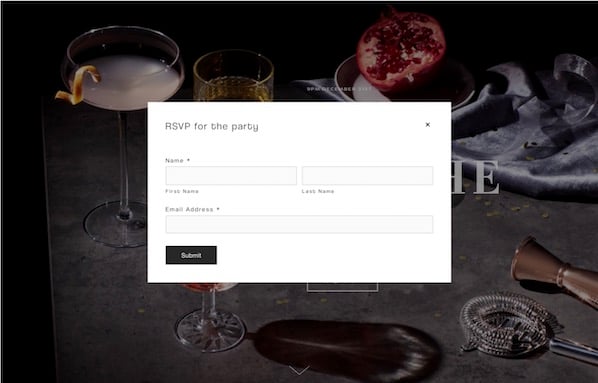
Royce is specialized for event reservations. There is no navigation bar, but the layout features a customizable background image, a headline, and a call-to-action button that says “RSVP.”

To fill out the form and reserve a spot, visitors can click the RSVP button to see a form appear, or scroll down below the fold to see a static reservation form. This is an interesting template because it amplifies visuals and keeps the layout simple while still offering visitors two ways to convert.
2. Invest
Available on HubSpot
This design includes a photo, customizable text, no navigation (to keep visitors focused on your offer), and a short form. Users can also customize and add other elements such as the icons seen at the bottom of the image. Below the fold, users can also add more information about the offer or company.
3. Hubstrap
Available on HubSpot
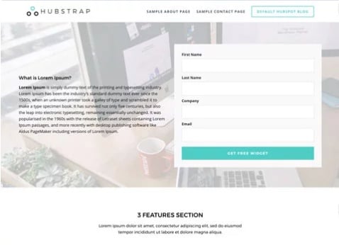
The Hubstrap template has a simplistic look and feel but devotes a bit more room to text. This might be a good option if your content offer has less imagery to go with it. For example, you might use this page to describe an offer or a long whitepaper on a topic related to your industry. Users can similarly personalize the design and add drag-and-drop sections to the page.
Unlike the above landing pages, this example does include navigation. However, it’s simple enough that it doesn't detract from the offer.
4. Landing Form
Available on HubSpot
This template includes a background image with a dark overlay, a headline, text, bright call-to-action buttons, and a form. It eliminates the navigation bar but includes a button at the top of the page. The image also has a dark overlay to keep it visible, but less distracting. As you scroll below the fold, this template also includes spots for more imagery and details that could relate to the product or offer.
5. Gradient
Available on HubSpot
Gradient is sleekly designed for a content-based offer. It has a simple layout with a form, headline, description text, photo, and logo, but continues the theme of no navigation. Like the other HubSpot templates, users can add a photo or product shot, a background image that appears behind a gradient color, and descriptive text. They can also adjust or change the gradient background’s color.
6. University
Available on Wix
This layout may be useful for those seeking leads for an educational event, course, or a similar service. The form is more detailed, but the layout itself also allows room for more text and imagery. Above the fold, you can see a headline, supporting images, and a form. If you keep scrolling, there are additional sections where more text and imagery can be placed.
7. Skyline
Available on Wix
This template may be helpful to a company or individual that hasn’t yet launched a website or product but still wants to gain early leads in the meantime. Above the fold, there’s a giant headline area, where the template has “Coming Soon” printed.
When you scroll down, you can see a quick description of the company and a box where visitors can add their email. Users can also add a photo or video to the background.
8. Online Store Coming Soon
Available on Wix
This template is very simple. Like the above “Coming Soon” template, the text could be edited to use this layout for a different purpose. There is no navigation and any information about the company is off to the corners. This layout allows space for a clear product shot, as seen with the shoes. Headline text, a small amount of descriptive text, an email box, and a button are pre-designed in the layout. Users can also link their social media accounts to the icons under the “Notify Me” button.
9. Lead-Gen Landing Page
Available on Wix
This template seems specialized for B2B products. It allows users to edit and customize the text and images through Wix. Users can also place background videos into the layout. The page is designed to be long, with the form and call-to-action above the fold followed by sections that detail different aspects of a company or firm, such as staff information.
10. Fagri
Available on WordPress.org
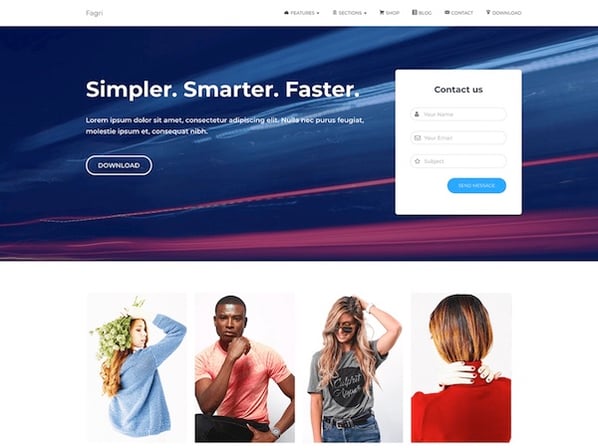
Fagri was designed broadly for multiple purposes and industries. According to its description, the theme’s widgets, such as the contact form are customizable. Users can also change the text and images. Although there is a navigation bar, the layout’s design still draws attention to the text, call-to-action buttons, and the contact form.
11. Real Estate Landing Page
Available on Wix
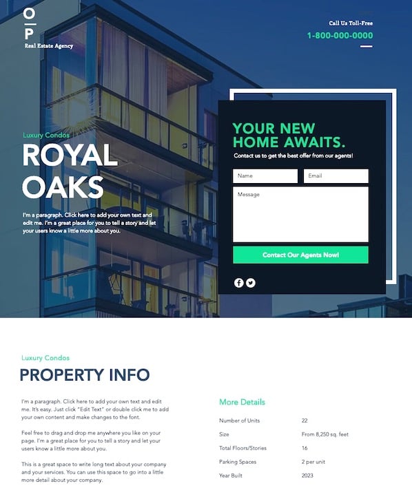
Although this template doesn’t offer a resource for information, it can be edited and customized to include an offer. As you scroll down the page, the background image can remain static. With the current page’s design, there is room to add company information below the fold. There is also a second form at the very bottom so visitors will have another chance to convert.
12. Construction and Lawyer Landing Pages
Both Available on WordPress.org
Wordpress also offers two similar Lawyer Landing Page and Construction Landing Page templates. Although the original designs are targeted at the two job fields, they can be customized to fit other brands and industries. Both have a header image, overlaid text, and an arrow pointing to a decently sized form above the fold. They also both offer the visitor a free quote.
13. Gardenhouse
Available on MailChimp
This template does not include a navigation bar, which forces a visitor to focus on the given offer. Towards the bottom of the page, it can be customized to include logos or other company information. Like all MailChimp landing page themes, this layout is optimized for mobile and will automatically adjust to different screen sizes.
14. Bandmates
Available on MailChimp
This template is also pretty simple with room for customization. It similarly removes navigation and keeps the company logo, text description, and a subscribe form above the fold.
Users can also drag in more elements, like text or form boxes, into the design. Just below the form, users can include a product shot or another image. The blue background allows the form and call-to-action button to pop, but these colors can also be customized to fit your brand.
15. O-Book
Available on Unbounce
Unbounce layouts come with its subscription, but here's one of the landing pages that you can test out with a free 14-day trial. This template is focused on book-specific lead generation. There is a clear spot for a product image, headlines, detailed description text, and a form box.
The top navigation is minimal, but it does include social media buttons. Since this layout is only free for a trial period, this might be a better option for a company that has already gained revenue from landing pages and is looking to test out a more detailed, but affordable design.
Landing Page Best Practices
The above templates already follow a number of landing page best practices. For example, many of them exclude a navigation bar, which may detract attention or clicks away from the offer on the page. Most of them also leave room for a photo or video. While photos offer a great product tease, videos have also been seen to increase conversions by 86%.
To learn about other landing-page best practices, check out this guide.

No comments:
Post a Comment