Before you break any email marketing habits or best practices, it's important to first understand why they work.
Once you've mastered basic email content creation, you'll be in a better position to experiment and test certain components of your strategy. In today's ultra-competitive email landscape, you need to perform tests in order to find out what drives your specific recipients to open, read, and click.
While the right content and design are necessary components for email success, running tests will help you understand how to stand out in your readers' inboxes. And to understand what to test, it's helpful to revisit your current strategies and consider which email habits might be appropriate to mix up, or break altogether.
In this post, we'll explore a number of commonly overlooked email habits you should start breaking and experimenting with to find the best strategy for your company.
11 Email Marketing Habits It Pays to Break
1. You always use the same sender name.
How to Break It: Get friendly with your "from" name.
While it's helpful to set certain expectations with your email recipients, don't limit yourself to only sending messages from your company name, or from one team member. Experimenting with "friendly froms" can increase open rates. For example, instead of simply sending an email from the name of your company, you might provide an employee's name, such as "Tim at Awesome.com"
But before you go crazy, always ensure your email activities do not violate the CAN-SPAM act. Your froms should not be false or misleading. However, there are ways your organization can make adjustments that delight your recipients.
Chubbies, a men's fashion company with over 1.5 million Facebook followers, is well-known for getting creative with their from names. While their approach is very specific to their organization's tone, style, and audience, you can look to them for inspiration.
One study found that while Chubbies' messages had slightly lower inbox placement rates, their "fun and unusual friendly forms" saw higher read rates and lower "delete without reading" rates.
Here's an example of how Chubbies gets creative with the friendly from:
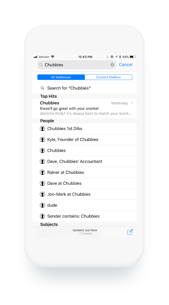
Chubbies also makes sure their fun "friendly" from names go with their subject lines and preview text.
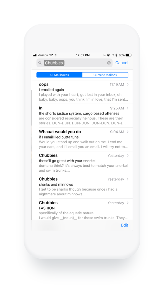
This synchronization allows them to use every space available to them in your inbox to grab your attention and make a lasting impression. Again, before testing strategies like this yourself, consult with a law professional about the CAN-SPAM act to ensure you're not in violation.
2. You treat your subject line too literally.
How to Break It: Write copy that visually stands out.
Consumers are inundated with emails all day long, which means your subject line is the one factor that will get someone to open your message.
Consider the following example:
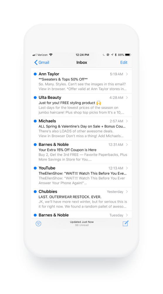
What stands out? Caps lock text? Numbers? The use of an emoji? Personalization? Humor? White space?
To catch someone's attention as they scroll through their unread messages, it's important to consider how your subject line appears next to others visually.
While your subject line text should reflect the contents of your message and match your organization's tone and style, it's important to use this space as creatively as possible. Test small tweaks with your audience to see if anything helps grab their attention.
3. Your preview text is auto-populated.
How to Break It: Use that hot preview text real estate.
If your email client supports preview text, also known as pre-header text, you can optimize it for every email you send. Allowing this text to auto-populate is a lost opportunity to grab attention or delight your recipients.
Though it takes some code, the use of this space will help you stand out from others who do not go to the same lengths to make theirs unique.
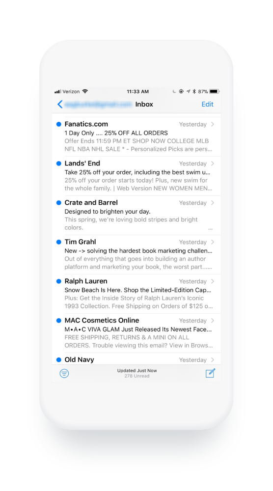
Experiment with clever, related text, like how Chubbies does in the example above, or try using just a few words to create more white space.
In the example below, Crate and Barrel writes preview text that is an extension of their subject line and creates eye-catching white space.
And in the following example, the Skimm uses their preview text to address a previous technical error in a light-hearted manner.
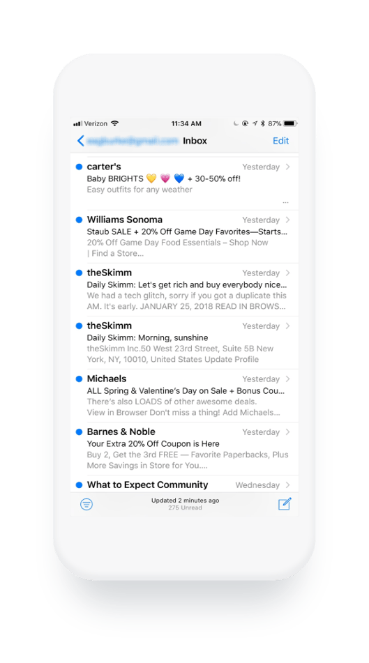
4. Your copy is so professional it's boring.
How to Break It: Develop a distinct tone of voice.
Your organization's tone of voice can be one of your biggest differentiators. Whether you use a certain style of humor or strive to sound as academic as possible, a well-crafted voice allows readers to connect with your organization on a human-to-human level.
In a time when technological advancement has us fondly looking to the past and remembering more intimate times, businesses can struggle to both scale and maintain the "humanness" of a mom-and pop-shop.
Your tone can help you combat that struggle. The answer is having a personality.
According to one of Chubbies' four founders, Tom, they thought, "Everything's a little too serious in men's fashion." To stand out and attract people to their brand, he says, "We wrote our emails like we were writing to our friends."
In a podcast interview by Smart Passive Income, he advised organizations to think about their own brand as a unique person.
"Think about it like a person with a personality. More often than not, that personality is going to be yours—as the business owner, as the person who's going to be writing or creating this content. Write about the things you care about, write about the things that have an emotional connection with you, and that's where you'll start to find kernels. We were not knocking it out of the park every time we wrote but because we were passionate about it, it enabled us to keep testing and keep driving."
When you approach your communication under this lens, you're bound to create content that doesn't just deliver a message, but also forms a connection.
5. Your CTA is literal.
How to Break It: Get creative with button copy.
Every inch of your email is an opportunity and each word should be intentional, especially the areas that ask your readers to take an action.
Here a few favorite examples of ways to get clever and entice your reader to click. Today's consumer is well aware of the fact that you're trying to lead them to a desired action. With that in mind, you might experiment with your call to action copy and use each "click here" spot as a chance to delight.
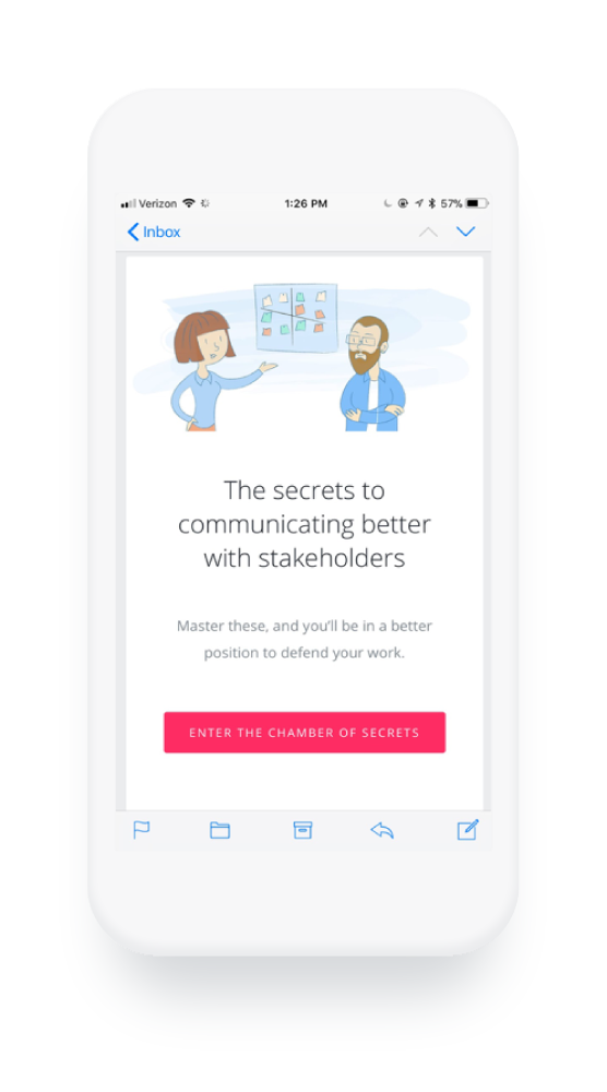
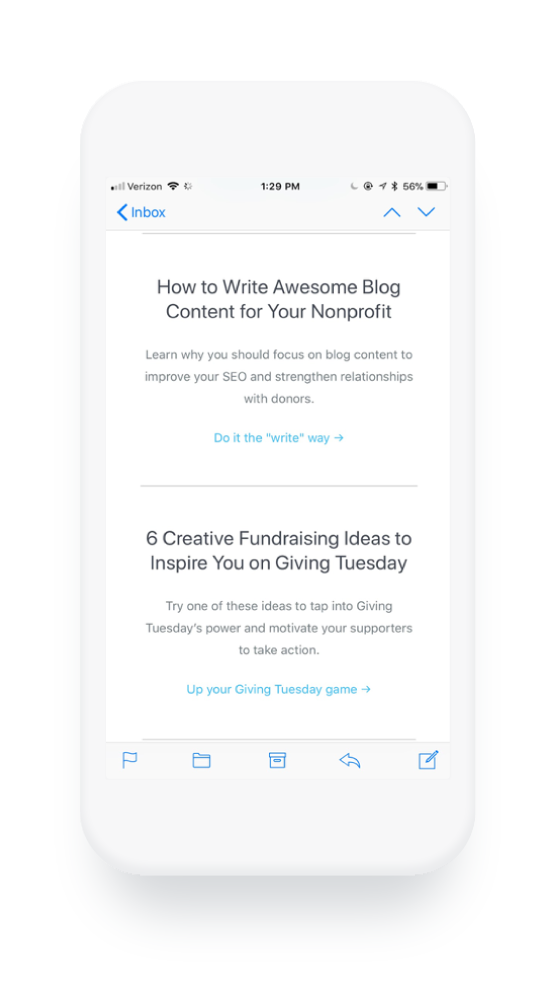
InVision uses witty copy and bright colors to catch the eye and entice its readers to click.
Classy, an online fundraising platform for nonprofits, similarly uses the CTA as an opportunity to be more playful with its copy and create a memorable experience for its blog subscribers.
6. You keep it short and sweet.
How to Break It: Experiment with length.
The Skimm's 6 million email subscribers prove that emails don't always have to be short and sweet, or highly visual to be successful. While some data points to ideally having relatively short email copy, the Skimm's emails can get quite long (though they are broken into sections for digestibility). And while they don't typically include very many visual components, they focus on making one thing very easy for the reader. Sharing.
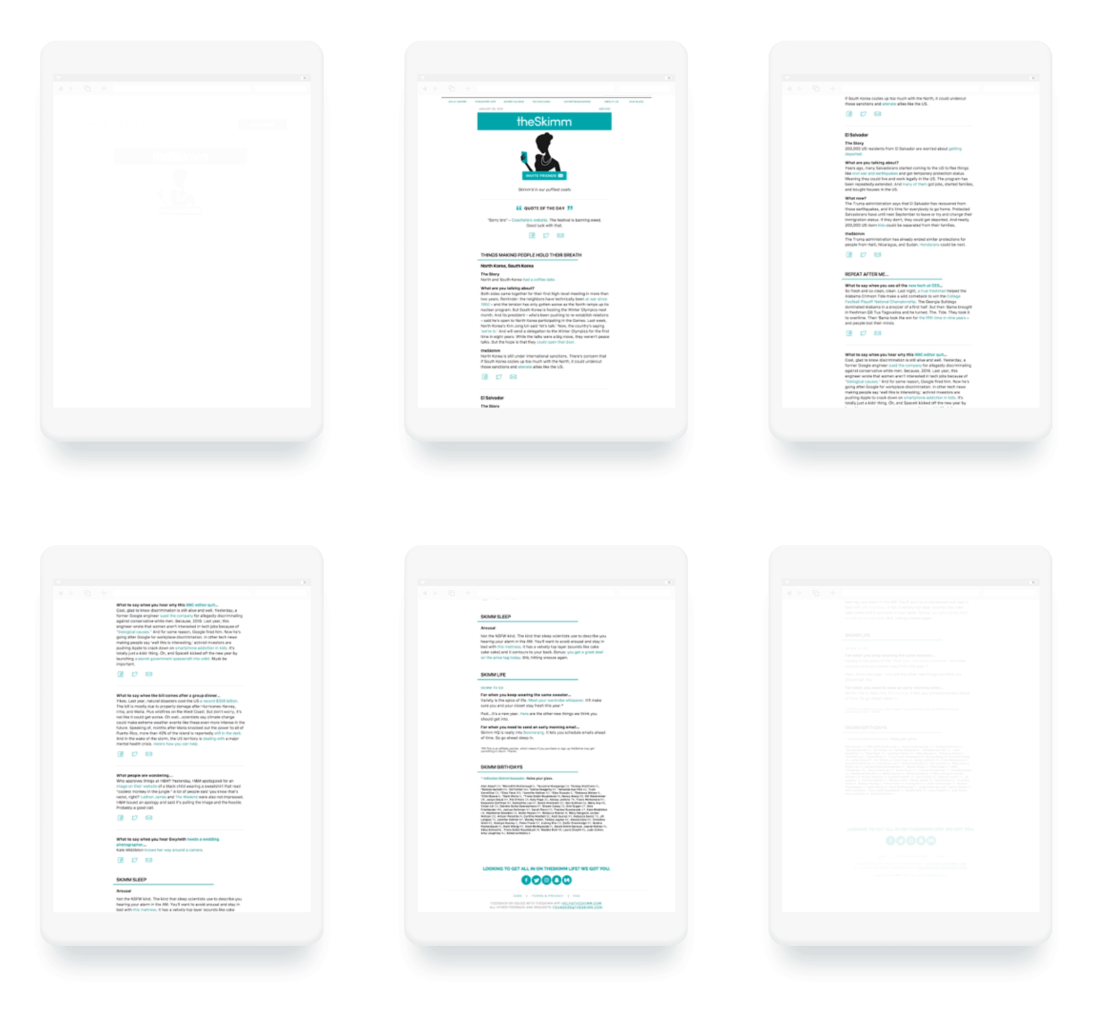
In this example alone, there are nine opportunities to share the email with a friend or colleague. Which leads us to our next habit:
7. You're focused on content.
How to Break It: Consider how design feeds growth.
If content is King, design is Queen.
Your content could be strong and interesting, but if your design doesn't include the ability to easily share your message, you're holding your content back. According to Bernadette Jiwa, author of Marketing: A Love Story, "Growth hacking is really the practice of creating and leveraging word-of-mouth with intention."
She continues, "Growth hackers optimize their business to acquire new customers by first delighting one customer and then making it easy for that customer to share the store with friends."
You work hard to ensure your content delights—don't send it off to die in the bowels of your clientele' inboxes. Incorporate tools that give your email the legs it needs to grow.
8. You use personas to make assumptions.
How to Break It: Demonstrate intimacy.
As marketers, we have to make assumptions. We can't possibly know each of our audience members intimately. While segmentation and building personas is important to delivering relevant content, today's consumers are expecting you to know more about them than ever.
If you can't demonstrate intimacy, you're going to fall short. If marketers aren't using segmentation by now, they're at least aware of the tactic and how other organizations benefit from it. While developing personas and lists to send more personalized messages is a step in the right direction, we can take action to further personalize our content and show readers we're paying attention—and that we're listening.
Consider what data you might share with your readers to develop a sense of intimacy or help them learn about their own behaviors.
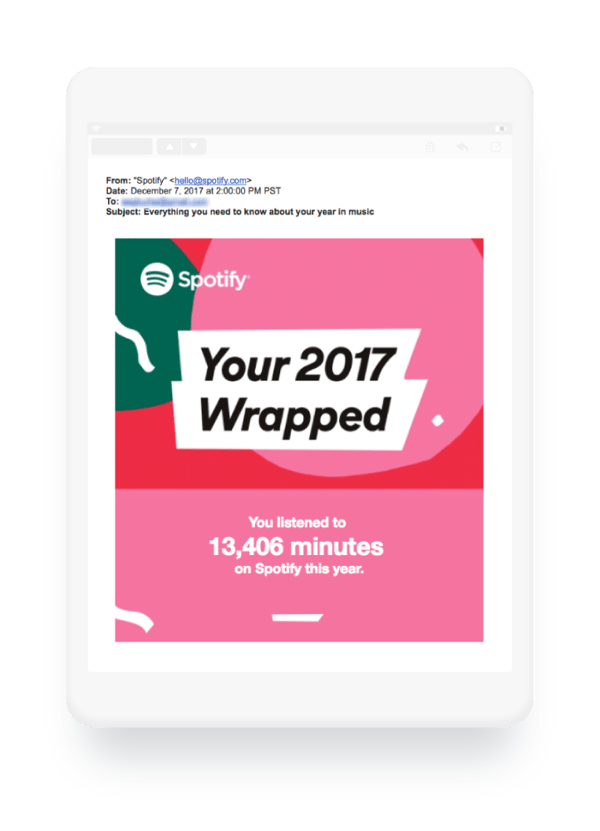
For example, Spotify uses data to demonstrate how well they know their users. These unique messages feel "one-of-a-kind" because they are. Each user receives a message with personalized data and insights around their own actions.
9. You talk too much about yourself.
How to Break It: Send an email, just because.
It can be easy for messaging to get a little out of balance. After all, your marketing efforts are intended to make your audience aware of the value of your products and/or services. But to become a brand that people identify with in a meaningful way, you need to do more than just keep them updated on your latest deals and features.
You need to add value to each person's life. Develop a cadence for connecting over something unrelated to your sales efforts, but very related to your organization's core values and culture.
This will help you to grow a following of like-minded individuals passionate about who you are and how you make them feel, not just what you're selling.
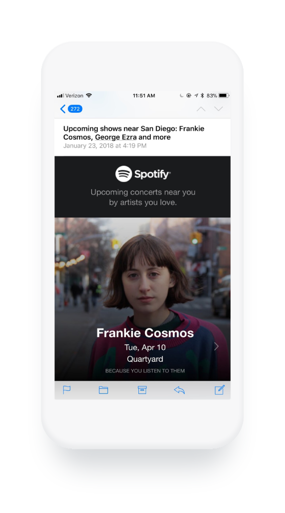
For example, Spotify sends messages to let their users know about upcoming concerts in their area:
Additionally, Chubbies sends a "Weekender" email every Friday that doesn't include links to products. Instead, they round up fun and entertaining bits of information purely aimed at providing a laugh. This fits right into their culture and core values, as indicated by the statement on their website, "We believe in the weekend."
According to Kyle, one of their founders, "It's all about all the wild stuff in the world and what you should be doing this coming weekend. And the purpose of it is to send you into the weekend. It doesn't drive sales. It's for nothing but creating a valuable experience with our customers. And we've done that every Friday for six years. That's part of how we build a real relationship with our customers."
10. You don't use double opt-in.
How to Break It: Send double opt-in confirmation emails.
When a user subscribes to your email list, you might think assume they want to read your content every week (or day depending on the type of email they signed up to receive).
However, that's not always the case. Using a double opt-in approach can ensure you have an engaged email list.
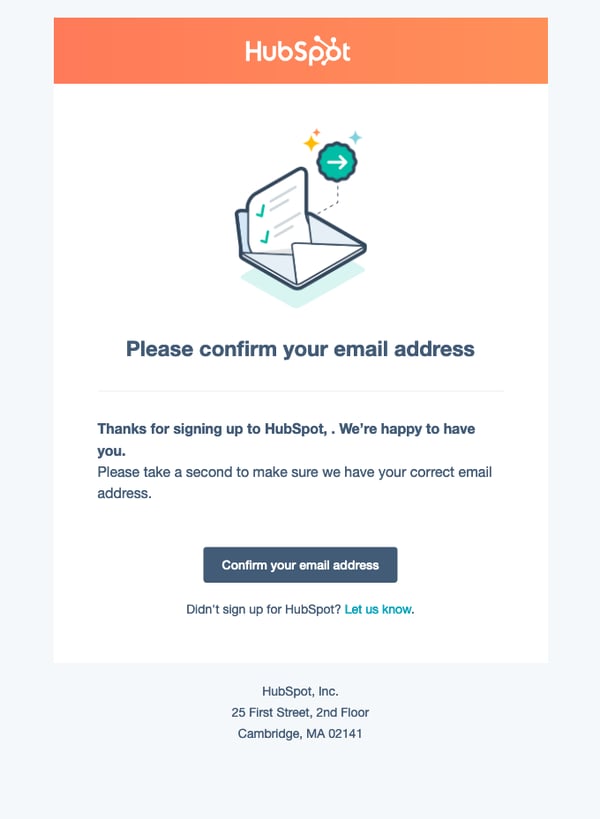
To do this, after someone subscribes, send them a follow-up email with a confirmation link ensuring they want to receive emails from you.
For example, HubSpot uses a double opt-in approach to ensure email deliverability rates and engagement is high.
11. You don't optimize for the mobile experience.
How to Break It: Send test emails and check on your mobile phone.
It's no secret that most people who read your email will be doing so on their mobile phones.
That's why it's important to optimize for the mobile experience.
Be sure to send test emails and see how your email comes across on mobile. Is the text big enough? Are the pictures the right size?
These are important elements that impact engagement rates on your emails.
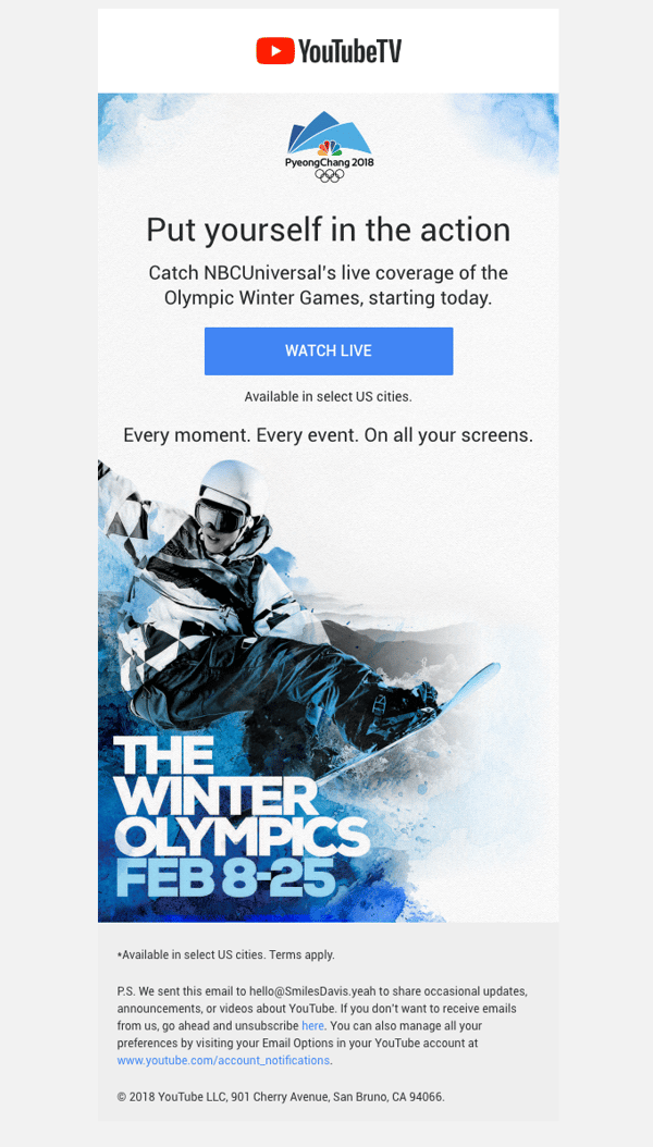
For example, below is an email on a mobile phone from YouTubeTV about the 2018 Olympics.
As you can see, the text is large enough that you can read it, and the images are displaying correctly.
While best practices emerge for a reason, if you're not regularly experimenting in this competitive communications landscape, your efforts will soon appear stale and your growth, stagnant. Build time into your team's workflows to reassess your current best practices regularly to allow for ample creativity.
Editor's note: This post was originally published in March 2018 and has been updated for comprehensiveness.
No comments:
Post a Comment