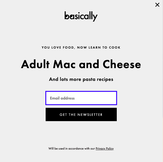
Today, I was scrolling the Bon Appetit website, and by the end of my visit, I'd signed up for their newsletter.
When I saw their newsletter advertisement, it was so effective that I just couldn't help myself.
Good ads get consumers to stop and stare. Effective ads inspire engagement. And when I saw this, I stopped scrolling, laughed, and typed in my email:

This ad successfully combines humor and relatable language to compel me to subscribe — additionally, it solved a "problem" (learning how to cook pasta) I didn't know I had. Those are three elements of what can make an amazing ad.
Oftentimes, marketers assume a good ad can only be made with a big budget. Additionally, marketers sometimes believe ads are most effective if they're busy or loud.
While having all the factors above do make for an enjoyable ad experience, they shouldn't be the only things marketers focus on when designing an ad. In fact, some of the most effective ads I've come across have none of them.
The ad above, for example, isn't busy, moving, or flashy at all, but it's still an example of a good ad. In this post, let's explore six components for creating a good, engaging ad.
Not every ad needs to have every single component to be successful. In fact, picking one to three of these components can still make a dazzling ad experience for consumers. Basics every ad should have, like engaging graphics, are covered in this excellent post about ad creation.
Additionally, the tips we've outlined below help elevate an ad, and can enable you to refine your ad to ensure it delights your viewers.
Use these tips as a reference when creating an ad or refining for finishing touches. They can be that last step before an A/B test, or a starting step when brainstorming content ideas.
1. Use keywords to rank on search.
Remember, keywords help rank highly on search engine results pages (SERPs). If a marketer wants to place an ad using Google, but doesn't use any keywords in their ad, it can be ineffective.
For instance, let's say I was Googling a laptop for professional use, so I type "business laptop" into Google. This is the first ad that comes up:

From this ad, I can tell that business laptops are being sold at Dell, which is what I want. Using ambiguous language in an ad doesn't bring much traffic. It also doesn't help consumers know what's being sold.
A small business would benefit using their industry or their product when advertising, especially if the product is in a niche market.
2. Solve a problem for your audience.
Your product or service solves a problem, and you probably know that advertising should tell the audience about how your product or service is a solution. If you're thinking this method is outdated, it doesn't have to be.
For instance, rather than taking out an ad in a newspaper or spending huge money on a billboard, you can use Twitter for Advertisers, a tool that lets users shop from the app by clicking on a link.
Take a look at Kohl's ad, which was created on Twitter's platform:
Shop comfy outfits for the whole family: https://t.co/S5Dv2UVMuC pic.twitter.com/XxKXcLesCf
— Kohl's (@Kohls) February 11, 2020
Copy such as "For the whole family" solves the problem of a busy parent having to go to different stores for clothes shopping. This ad is effective, showing siblings of different ages modeling clothing in a comfortable home setting.
By clicking on the ad, consumers will be able to see every piece the models are wearing, the price, and even purchase items without leaving the app.
3. Ask your audience important questions.
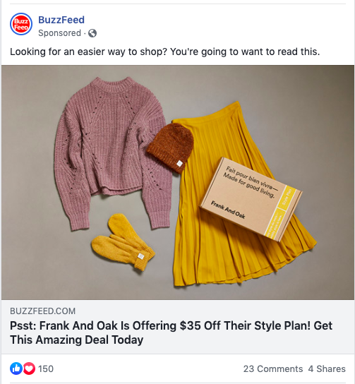
Asking questions engages idle consumers. A question gets browsers thinking, much like the copy from this ad from BuzzFeed on Facebook:

Language in this ad is great — it's fresh, young, and personable. If I were idly scrolling Facebook, I'd pause on this ad because I'm always looking for an easier way to shop. Here, BuzzFeed recognizes a pain point of its readers and pulls readers into the article by identifying it with a question.
The way the relatable question is posed would make me look at the ad, while the no-frills design of the ad (a simple photo), coupled with the call-to-action, ("Get This Amazing Deal Today") would make me open the ad.
That initial pull to the ad is possible due to the question. Ultimately, by beginning your ad by posing a question that peaks interest, you're inviting viewers to click.
4. Include a customer or user's testimonial.
The reason consumers love websites like Yelp so much is that it's an entire platform of customer reviews about a product or service that help consumers make more informed decisions.
For instance, check out this ad for TriNet:

"Learn how one C.E.O. imagines passion in the people who work there" — this copy effectively notates a powerful key player of business and caters to thought leadership.
The headline, "These Employees Know Their Work in Making a Real Difference in the World," is a powerful sentence that plays to emotions — it makes readers think, "Am I making a difference in the world? How are they? I should click on the ad and find out."
By letting satisfied customers speak for you, you can deliver an ad message that's personalized and relatable. Additionally, having that boost of a real-world interpretation of your product or service makes you more reputable.
5. Evoke a sense of urgency in your copy.
Using a tone that's urgent makes consumers feel like they need a product in their life. Take this ad, for example:
This copy carries a sense of urgency to download the whitepaper. The caption introduces the ad and says what the ad doesn't, saving space for more copy, and making sure all the important things are included.
Notice how the ad copy mirrors a CTA. To create urgency in your advertisement, you might consider using call-to-action language, such as "Learn," or "Discover," which engages browsers in a way that's professional and knowledgeable.
6. Use data points.
Numbers are informative. Statistics and data visualizations get the mind moving and bring numbers to life. And the best part is, numbers aren't just for ads about sales or data points.
these are a few of my favorite things 👀
— 22 Words (@22Words) September 19, 2019
For instance, this promoted tweet has nothing to do with statistics or data collection. It's a blog post for an Amazon round-up of bags, plants, and more knick-knacks.
As a consumer trying to waste time on social media, a blog post about 30 A-plus purchases from Amazon sounds like music to my ears. The relatable language of "100x Again" is a clever way of including numbers that are convincing without confusing or boring the audience.
Ultimately, numbers make an ad seem impressive, show research, and also connect with a younger crowd, making an ad more clickable.
When planning out ads, consider whether or not you would be engaged if you saw it, and use tools that help achieve that vision.

No comments:
Post a Comment