It's that time again. You've spent countless hours creating and executing a campaign, and now you're finally ready to present the results to your boss. You've rehearsed your presentation meticulously, and feel great about the whole deck ... except that one slide that shows a report that doesn't quite make sense.
Even though the rest of your data is compelling, you know your boss will somehow find a way to focus on the one chart that isn't. And while you might not always like it, we'd argue that the most important part of any campaign comes after all the work has been done. In other words, that one chart really does matter.
Sure, it's easy enough to make simple charts, but to really take your next reporting to the next level and present the true impact of your work, you need to be laser-focused on the details. To help make your next presentation even better, we've put together a list of 10 quick and easy reporting tweaks to get you started. More specifically, we'll walk you through how to make these changes using both Excel and HubSpot's Reporting Add-on below each example.
10 Ways to Make Your Data More Compelling
1) Change your chart type.
Not all marketing data is created equal, so it can’t all be presented in exactly the same way. If you want to compare values -- for example, you want to determine whether your latest webinar or trade show generated more MQLs -- you’ll want to use a column or bar graph. If you want to show your team trends in data over time, use a line or area graph.
Here’s an example of how choosing a different chart type can clarify your report.
Before:
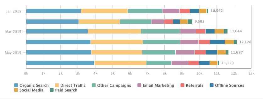
After:
While both reports show the same data -- the number of MQLs generated over time, broken down by original source -- the second variation, an area chart, gives the viewer a much better sense of how MQL flow has varied over time.
How do I make this change in Excel?
Follow these simple instructions to change your chart type in Excel. Not sure which chart type to choose? To get a sense of your options, take a look at this help document from Microsoft.
How do I make this change in HubSpot?
In HubSpot's Reporting Add-on, start by selecting the report you want to edit. Then, use the toolbar on the right to choose your desired visualization.
2) Plot performance against your previous benchmarks.
Let's say you just published an awesome new ebook. To your delight, your lead generation numbers spike as a result. Fantastic! However, your boss always asks the tough questions: Growing leads is good, but is it out of the ordinary?
How can you update your report to show your boss how your lead generation data compares to the norm? Add an additional data series to your report that shows the same metric over a previous timeframe.
In the example below, you'll see contact growth over time -- with and without the previous month's data overlaid.
Before:
After:
Adding the additional context provides a better snapshot into how your performance compares to the recent past.
How do I make this change in Excel?
There are several ways to approach plotting previous benchmarks in Excel. However, it's often easiest to add an additional column of data that represents past performance, and plot that alongside the current time period. Find out a bit more about that approach here.
How do I make this change in HubSpot?
In HubSpot's Dashboard, use the filter at the top of the screen to plot any time period against a past benchmark. The tool defaults to this month vs. last month, but feel free to customize the data around your organization's reporting cadence.
3) Change the order of your data.
Even if all the right data is included in your chart, it's pivotal that it's arranged in a logical and intuitive way. Order your categories alphabetically, sequentially, or by value.
In the example below, we chart the speed of our sales cycle, broken down by original marketing source. With this report, we're seeking to understand which sources bring in the fastest-closing leads, as well as which source's leads close the slowest.
Before:
After:
See the difference? If the data is randomly arranged, it's much harder to glean strategic takeaways.
How do I make this change in Excel?
Excel makes it easy to change the order of your data. Follow Microsoft's instructions here.
How do I make this change in HubSpot?
In HubSpot's Reporting Add-on, start by selecting the report you want to edit. Then, use the section labeled "Order by" to customize the sequence of values or categories.
4) Show data markers.
If you're plotting a trend over time, it's often helpful to add line markers, which show the stepwise change in the data between intervals. In the example below, we're plotting MQL growth over a specific week, broken down by original source. Adding markers helps to clarify the discrete jumps in the data between days, making it easier to draw conclusions about what worked over time.
Before:
After:
How do I make this change in Excel?
To add data markers to your line chart in Excel, use these instructions.
How do I make this change in HubSpot?
In HubSpot's Reporting Add-on, start by selecting the report you want to edit. Then, uncheck the box labeled "Hide Line Markers" to make the change.
5) Display cumulative data.
If you'd like your chart to show aggregate growth, plot it cumulatively. In the example below, the takeaway from the first chart might be "we generated more MQLs in the second half of the date range." In the second, the overall impact of MQL generation is more apparent: over 1,500 MQLs were generated, with accelerated growth over time.
Before:
After:
How do I make this change in Excel?
While there's not a single solution to creating a cumulative chart in Excel, this article walks you through one way to tackle it.
How do I make this change in HubSpot?
In HubSpot's Reporting Add-on, start by selecting the report you want to edit. Then, check the box labeled "Cumulative" to transform your chart.
6) Remove superfluous numbers.
Not all data is imperative to show. Remove unnecessary data points in situations where your properties aren't as clean as you'd like, or where certain responses aren't relevant to the questions your team is asking.
Just remember to be tactful in cleaning up your reports. Don't remove data just because it doesn't tell the story you'd like it to.
Before:
After:
How do I make this change in Excel?
To add and remove data from your charts in Excel, use these helpful tips from Office's tutorials.
How do I make this change in HubSpot?
In HubSpot's Reporting Add-on, start by selecting the report you want to edit. Then, click on the data categories beneath your chart to show or hide the data in your report.
7) Plot a goal line.
Raw data is great, but it doesn't always tell the whole story. Let's say you generated 500 MQLs this month. Nice work ... but so what? How does that compare to what you had hoped to achieve? Adding a goal line helps your team drill into your performance compared to expectations.
Before:
After:
How do I make this change in Excel?
Similar to the second example, there are several ways to solve this problem. However, it's most easily done with an extra column of data representing your company's goal.
How do I make this change in HubSpot?
In HubSpot's Reporting Add-on, start by selecting the report you want to edit. Then, select the "Include Monthly Goal" checkbox to add your goal line. Note that plotting a goal line is only possible when viewing a current date range in area and line charts.
8) Stack your data.
Too much data can be overwhelming. Stacked visualizations make it easier to spot trends in totals across categories, whereas grouped charts are better for comparing individual values within categories. Depending on the question you're trying to answer, choose the type of report that makes the most sense.
Imagine you're plotting your leads by month, broken down by their industry, and your goal is to compare industry lead generation within individual months. Here's a question you might run into: Did we generate more leads from Higher Education or Biotechnology in April?
In a stacked bar chart, it would be hard to get a sense of the relationship between those two industries in a given month. In this case, it's better to use a grouped bar chart, where the magnitude of individual values within the time periods are more apparent. On the other hand, if you wanted to focus on how individual industries contributed to overall lead generation (with an emphasis on total leads), a stacked chart would show aggregate totals much more clearly.
Before:
After:
How do I make this change in Excel?
Generate a stacked column chart in Excel with these easy instructions..
How do I make this change in HubSpot?
In HubSpot's Reporting Add-on, start by selecting the report you want to edit. Then, select the "Stacked" checkbox to implement a stacked chart.
9) Change your color scheme.
Not all of us are artists. But most of us can tell when a color scheme just doesn't work. If you're presenting a set of data with several options, choose a color scheme that shows a clear distinction between the options. Otherwise, the data is rendered meaningless.
Not sure what makes for an effective color scheme? Find out all you need to know here.
Before:
After:
How do I make this change in Excel?
Excel makes it easy to change your color scheme. Follow these steps, and your colors will be popping in no time.
How do I make this change in HubSpot?
In HubSpot's Reporting Add-on, start by selecting the report you want to edit. Then, make a selection from the "Colors" dropdown.
Pro Tip: Use different colors to differentiate between categories of reports on your dashboards. For example, you might make data relating to deals or opportunities green, while shading marketing-related reports blue or yellow.
10) Flip your axes.
Switching your X and Y axes can enable your chart tell an entirely different story. In the example below, we've plotted Original Source Type against Lifecycle Stage for a set of contacts.
In the "before" snapshot, a key takeaway might be that the majority of contacts generated through Offline Sources ended up as customers. However, it's difficult to know what proportion of the Customer lifecycle stage came from Offline Sources.
Flipping the chart around enables us to drill into that additional context. The "after" image gives us a better understanding of how big of a role Offline Sources played in generating Customers. While both charts provide actionable takeaways, it's important to consider the question you were hoping to answer to begin with. Often times, the opposite axis orientation might provide you with the best answer.
Before:
After:
How do I make this change in Excel?
Stack Overflow provides a quick and easy process for switching your axes without manually changing your data.
How do I make this change in HubSpot?
In HubSpot's Reporting Add-on, start by selecting the report you want to edit. Then, swap the values of the report configuration dropdowns. For the above example, here's how you'd make the change:
↓
Now you're ready to make your data pop and take your reporting to the next level. Here's hoping you'll never again have to present a chart to your boss that doesn't quite make sense!
Which tweak did we miss? Let us know in the comments below.

No comments:
Post a Comment