The other day I was shopping online for a Nintendo Switch, a popular handheld gaming console.
The popularity of the console has made it extremely difficult to find one — stores like Best Buy and Target were out of stock.
This meant that I had to reach outside of my comfort zone when browsing. I scoured Google to find an ecommerce option that carried the Switch.
Even though I was desperate to reach my goal, I was very selective about where to shop. As a consumer, website design is one of the biggest factors I take into consideration when choosing where to spend my money.
If the website design isn't committed to user experience, I immediately deem the company as unprofessional. I'm not alone, either. In fact, 48% of people use website design as a deciding factor when determining the credibility of a business.
If you're wondering about the usability of your ecommerce website, this post is here to help. We'll go over some ways you can improve the design of your website, as well awesome examples that put these tips into practice.
Before you upload your next product page, take a look at these pointers below to help.
1. Make the website user-friendly.
When it comes to ecommerce websites, user-friendliness is a must. Customers have to be able to easily navigate through your website to make purchases.
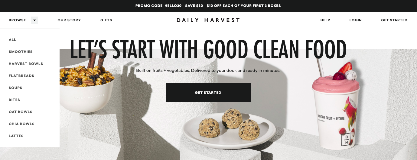
Take the Daily Harvest website, for example. The homepage clearly states the purpose of their product and the CTA to "Get Started" is a quick link to explore purchasing:
The homepage also has a dropdown menu so customers can easily navigate towards what they're looking for. Dropdown menus keep a website organized and reduce the busyness of a homepage.
2. Ensure a secure checkout process.
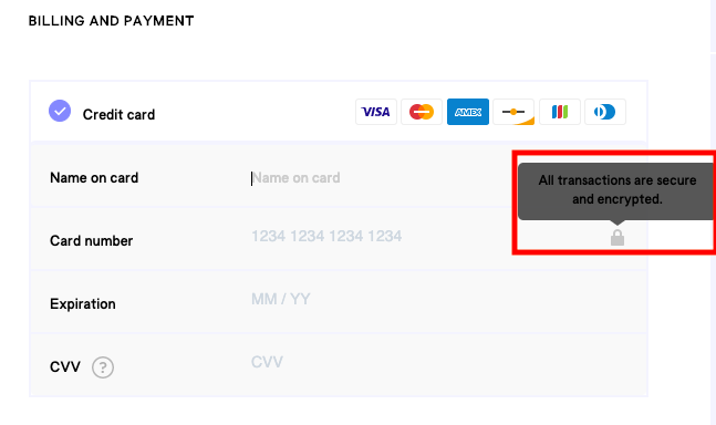
If shopping is available on your website, make sure your customers know their credit card information is secure. There are a couple of ways you can do this. First, as shown on the website for beauty company Billie, you can include this in an "info" button:
Info buttons are useful if you want to display secure checkout information but want to avoid crowding checkout pages. However, if you want to state checkout security more visibly on your website, like in a paragraph at the top of your "Place Order" page, that could be helpful to website visitors who may be wary of purchasing online.
3. Add filtering options for your products.
As a consumer, I love filtering options, which can help me easily find products or services. That's why they're a must for your ecommerce website: Customers who know exactly what they want can find it without having to sift through too many options.
Take this filter list from The Little Market, for example:
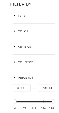
The fair trade home decor website has pages and pages of offerings, so this specific filtering system helps consumers find what they're looking for based on multiple categories.
When you design your filtering system, make sure you make the categories broad enough to fit all of your products, but specific enough to be helpful to customers. For example, a website for a record company that sells merchandise might have filtering options based on artists, genre, or the label's apparel.
4. Include customer service capabilities on your website.
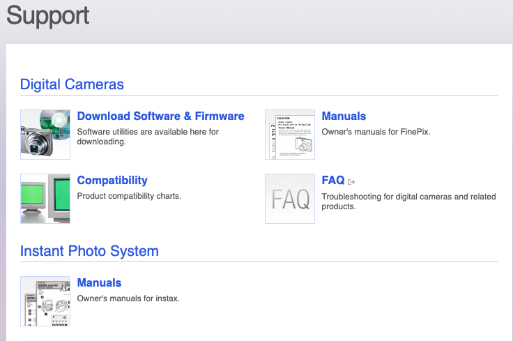
Customer service capabilities can include an automated chatbot that answers FAQs about your product or service. Alternatively, you can have a fully-fleshed out support section of your website that offers more information about your products, like this one from camera company Fujifilm:
This section provides free information about how to use the various cameras the website has available, including downloadable manuals and software for photo editing. It's helpful to provide resources like these to customers if you sell a product or service that might have features that need a little more explaining, like a camera, or automated software.
5. Have the right CMS.
Choosing the correct software to help you manage your ecommerce site is just as important as fine-tuning the customer experience. Software should be able to support all of the functions in this list and be easy to use for you and your team.
For instance, does your CMS allow you to create a responsive webpage, like in this screenshot below?
HubSpot's CMS software is accessible for marketers, web designers, and IT specialists. It supports responsive designs, customer service chatbots, forms, and lets you manage all of those in one place.
If you're in the market for a CMS, take a look at The 8 Best CMS Systems Today & How to Choose.
6. Jazz up product descriptions.
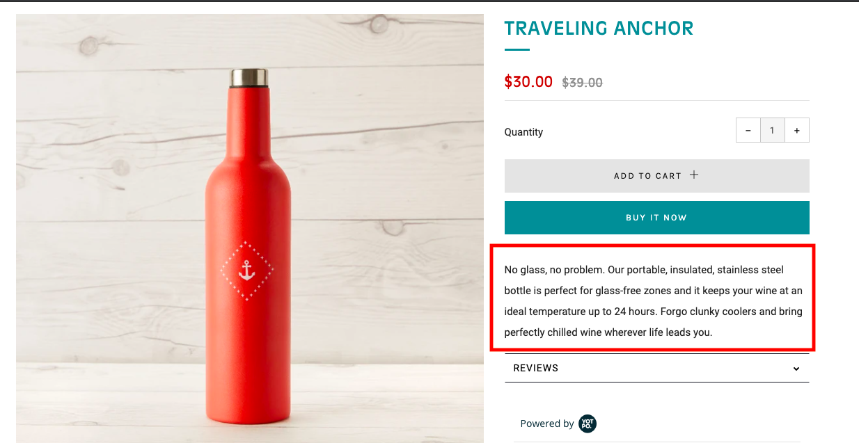
If you want to continuously delight customers, make your product descriptions fun and engaging. The thrilling website copy shouldn't stop with your homepage — make sure you carry the personality of your brand throughout the content of the entire site. Take this tumbler product description, for example:
"No glass, no problem," describes the appeal of the product right out of the gate in an appealing way. The description then goes to explain highlights about the product, and ends with a hook to really sell the anchor to customers: "Forego clunky coolers and bring perfectly chilled wine wherever life leads you."
Feel free to use a similar method when describing your company's offerings. First, start with an engaging introduction. Then, spotlight some essential features of your product that sets it apart from customers. Finally, give a visual about how the product will enhance the quality of the customer's life.
7. Integrate social media on product pages.
Social media icons on your ecommerce website? Absolutely. Social media buttons improve the visibility of your brand.
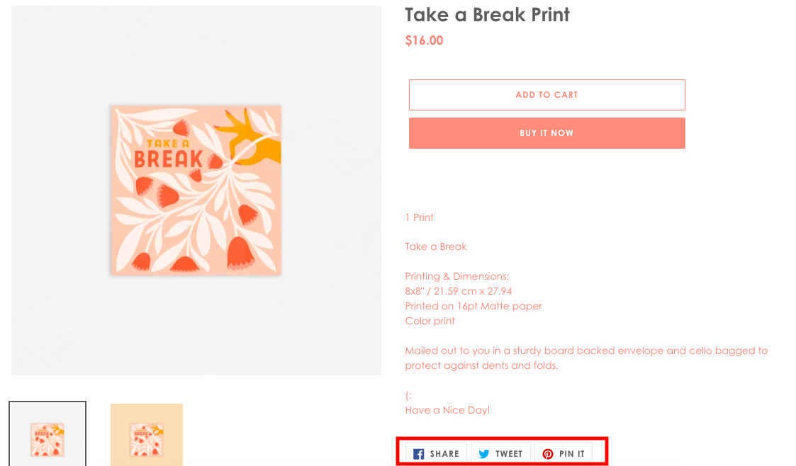
For instance, if I wanted to share the print below on my Twitter account, the buttons make it easy for my followers to click the link if they're interested in learning more:
Social media sharing options give shoppers the opportunity to share your products with their circle of friends and family, giving you exposure to a larger audience.
For more information about social media marketing, check out this ultimate guide.
8. Include the customer voice for your products.
The voice of the customer is important to display on your site. It gives prospects an idea of how the product or service can help them from other customers, which likely seems more trustworthy than a product description from the company itself.
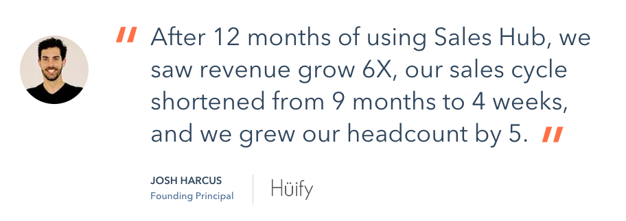
This testimonial from a sales specialist gives HubSpot's Sales Hub software credibility. It proves that the software works for SMBs and provides data about how. As a big plus to adding testimonials on your site, if you contact loyal customers about giving one for your product or service, they'll feel like their voice matters to your company.
9. Make your website responsive for mobile devices.
Did you know that by 2021, it's expected that smartphone purchases in the U.S. will increase to over $350 billion? This is up from $148 billion in 2018. This is why making sure your ecommerce site is responsive for mobile is imperative to delighting customers.
More and more consumers are completing purchases on their smartphones, so having a site that's optimized for a phone screen makes purchasing easy and delightful for customers. For an example, let's look at Chicago-based coffee retailer, Dollop Coffee Co. Here's what the shopping tab looks like on desktop:
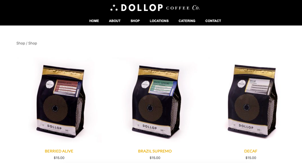
Products are labelled clearly, the photos are large and clear enough to be seen by desktop browsers, and the navigation is simple to understand. Comparatively, let's look at the same tab on mobile:
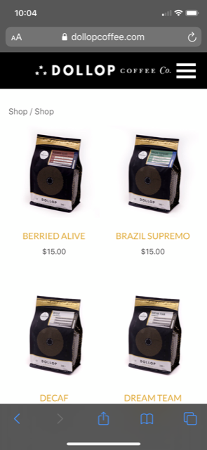 Notice how in the mobile responsive design, the photos are smaller, and four products are displayed in a different format than the desktop version. These small changes make navigation on mobile as easy as on desktop.
Now that you're equipped with some tips for stellar ecommerce web design, let's look at how some of these practices look in-action with some stellar examples of ecommerce website designs.
Best Ecommerce Website Designs
Let's look at some websites that are using some of the techniques listed above to delight their customers and offer a well-rounded shopping experience.
1. Bandcamp
Tactic: User-friendly site design
Bandcamp is a website where record labels and independent artists can share and sell their music. On select Fridays, Bandcamp gives 100% of their profits to musicians. Bandcamp's service calls for a website design that's easy to use for consumers and artists:
This is the band page for Chicago-based band Frankie Cosmos. Notice how Bandcamp's site design makes it easy for the page to be personalized to the group's brand. Additionally, there's multiple options to purchase the record using Bandcamp's tools, as well.
Bandcamp's user-friendly website encourages consumers to explore without having to learn the ropes.
2. Yelp
Tactic: Robust filtering options
Yelp's website is expansive — it's a platform for consumers to leave reviews about shopping experiences, and a chance for business owners to increase their visibility and connect with customers.
The filtering options on Yelp makes finding what's intended an easy venture for customers. They can choose their own adventure, and look for options based on vicinity, business type, hours, price range, and more.
If your website hosts a multitude of services like Yelp, think about how you can expand your filter options to fit the needs of customers.
3. Scoop N Scootery
Tactic: Compelling product list
For Boston-based ice cream shop Scoop N Scootery, website design is a piece of ice cream cake. The website is an incredible branding tool. It keeps the spirit and personality of the business consistent, right down to the menu:
This interactive and fun take on the menu engages a first-time visitor while giving them a taste of the business's brand.
4. SimpliSafe
Tactic: Customer support options
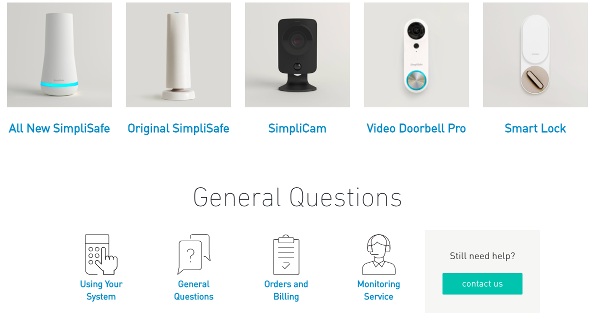
SimpliSafe offers home security systems, and the company website is a helpful homebase for questions about home security, cameras offered by the company, and the features of each.
SimpliSafe's website also boasts a Help Center:
This Help Center offers a form for more information about cameras, extra reading about products, and is organized in a clear format. If one of the goals for your website is to improve customer service capabilities, the SimpliSafe Help Center is a great place to look for inspiration.
5. Rothy's
Tactic: Engaging product descriptions
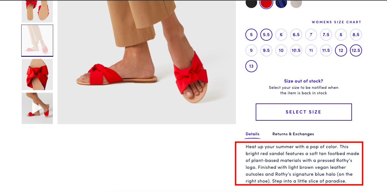
Shoe company Rothy's has fun with their product descriptions. Rothy's footwear is made from recycled water bottles and boasts a heightened sense of comfort. For a new line of sandals, the team at Rothy's focused on comfortability and warm weather:
This product description uses compelling copy to relate to the reader. Additionally, when mentioning the senses, the short paragraph helps users imagine the emotions owning the shoes will give: happiness, relaxation, and stylishness.
Evoke the emotions of consumers with your product descriptions. Chances are, many are visiting your ecommerce website for the first time, so give customers copy that makes them want to know more.
This afternoon, I'll try my hand once more at purchasing the Switch. I'll be looking at the design of websites for clear purchase instructions and secure checkout options. I'll also be searching for a certain type of model, so having filtering options will be a huge plus.
When you think about your ecommerce website, what are some of the standout features? Where are some areas you can improve upon the design? Take these into consideration when you're redesigning, and your customers will find themselves delighted by your website.
Happy website building!

.gif?width=600&name=ezgif.com-video-to-gif%20(11).gif)
.gif?width=600&name=ezgif.com-video-to-gif%20(12).gif)
-1.gif?width=600&name=ezgif.com-video-to-gif%20(13)-1.gif)
No comments:
Post a Comment