There's more to ecommerce website design than you might think. Everyone gets it sort of right, but not every site out there does it all -- except perhaps ModCloth.
I may not shop there personally, but I’m a huge fan of the ModCloth ecommerce inbound marketing model. When breaking down the anatomy of an amazing ecommerce site, ModCloth seems to have it all, from an elegant and intuitive design, to pre-transactional educational content, to email marketing that rarely relies on coupons.
As marketers, we have to get beyond the echo-chamber of sites we personally shop with to find great examples of inbound marketing for ecommerce in action. I don't normally shop ModCloth, but many others do, and they've been highly successful. Let’s take a look at what makes ModCloth such an inbound marketing powerhouse.
Homepage Design
Okay, so saying they do everything well is a bit of a cop out. However, if we look at the welcome banner visitors see upon visiting the page, we see how easy various components of a great ecommerce site are to find.

In one place, we see the page identity, the personalized welcome, a link for customer service, a search bar, special offers, the shopping bag, and an easy-to-understand menu. Wow. That’s a lot of stuff in one space, and yet nothing is crammed or hard to see.
Blog Design
ModCloth must know that business sites with a blog get 55% more visits than sites without. Of course, as you can see by the menu image above, the blog must be part of the main ecommerce site for those visits to be counted in ModCloth’s metrics.
ModCloth uses their blog to move potential buyers through the marketing and sales funnel, just as it’s designed to do. The blog features products, how-to videos, images from customers, and general lifestyle information. In addition to working hard for the business, the blog is also a great way for people to spend a few minutes of downtime.
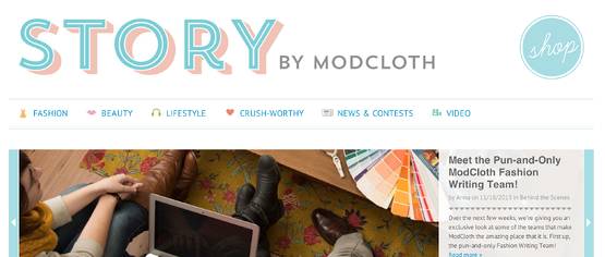
Their great strength in blogging is that they're targeting the lifestyle, or psychographic dimensions, of their buyer personas. They're not just churning out keyword rich content to rank in search engines; they're building an audience of relevant consumers that they can nurture toward a purchase.
Filtering Options
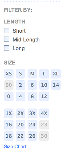
In addition to the search bar at the top right corner, ModCloth also offers a very intuitive filtering process for every item. Users can search by size, price, designer, and popularity. The easy-click buttons leave little room for error, so customers can quickly narrow down options to find exactly what they need.
As a bonus -- and this shouldn’t be a bonus so much as a way of life -- the filtering options really do return only relevant search results.
Customer Service
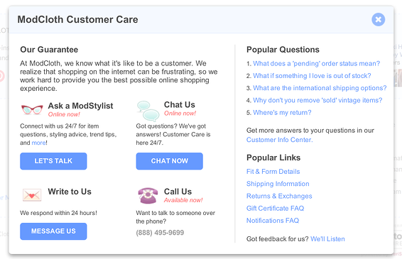
While ModCloth customer service does offer an email option, the company also make employees available through a live chat option or by phone for those buyers wanting immediate service. These options can all be found in one spot, too, by simply clicking on their Customer Care link.
But ModCloth doesn’t stop there. Not only can you find someone to talk to about the questions or problems you might have, but you can also reach out to a stylist to receive personalized suggestions and recommendations.
Secure Checkout
Buyers love ModCloth’s checkout process because it’s clear and linear. You can see from the progress bar at the top of the page that you’ll be taken through each step in the process with no links back to previous pages or unnecessary paths toward other pages.

They also make sure to show their security certificates with large icons so they’re visible. This gives buyers the warm and fuzzies, letting them know personal information will be protected at all costs.

Finally, they also offer alternative payment methods so buyers don’t need to share credit card information if they don’t want to. The ability to purchase through PayPal is just one more way ModCloth makes buyers more comfortable.

Up-Front Info
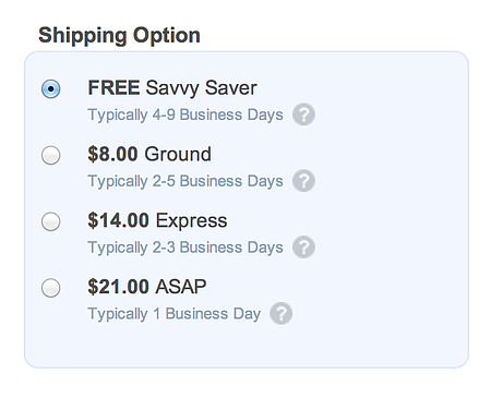
One of the biggest reasons buyers abandon shopping carts before finishing the purchase is because the cost of shipping is a surprise. Well, ModCloth makes sure buyers get up-front info about shipping. As you can see, buyers willing to wait a bit for their new threads can also take advantage of free shipping. Cha-ching.
Fun Product Descriptions
It’s easy enough (and conducive for search engine optimization) to simply list the basic stats, but ModCloth gives whimsical descriptions that still manage to convey the most necessary information. Sometimes, it’s fun to just read about the products even if you can’t afford to buy them all.
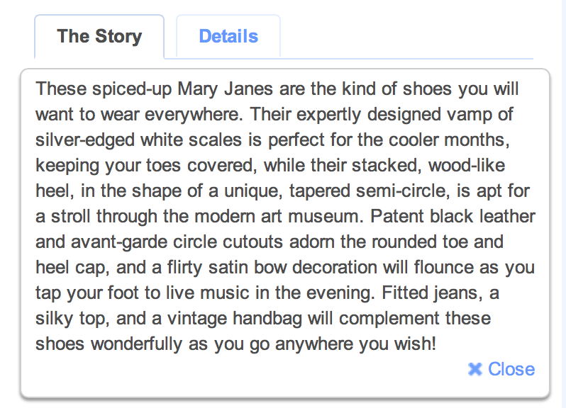
Again, the key factor here is the customization of the website experience to the psychographic dimensions of their buyer personas. They're not cold, clinical recitations of the manufacturer specs, they're written with the tone and information that their best customers want to read.
Social Media Integration
This company does a great job of including and engaging with followers and friends on social media. As you can see, visitors have several chances to connect with various social platforms during the shopping experience.
The first time comes on the main page, where all the different accounts are listed. Next, buyers have a chance to Tweet or Pin the items they’re about to buy or just recently purchased. In addition to bragging rights for the customers, it’s also good press for ModCloth.
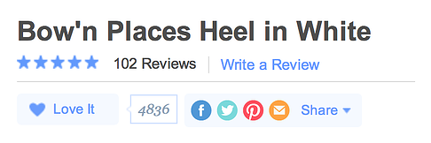
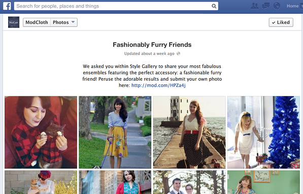
Finally, the company does a great job of keeping social outlets current. Facebook includes images contributed by users and not just those posted by the company. Twitter asks random questions throughout the day to boost engagement and make followers feel included.
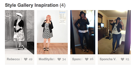
Instagram features heavily on the site as both a user-generated style guide and a place where customers can share videos with their thoughts on the products and the brand.
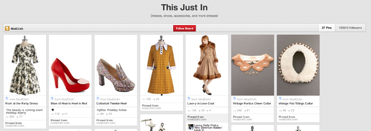
Pinterest is used for various reasons, but perhaps most importantly as a secondary product catalog. Whoa. These guys are busy.
Customer Voice
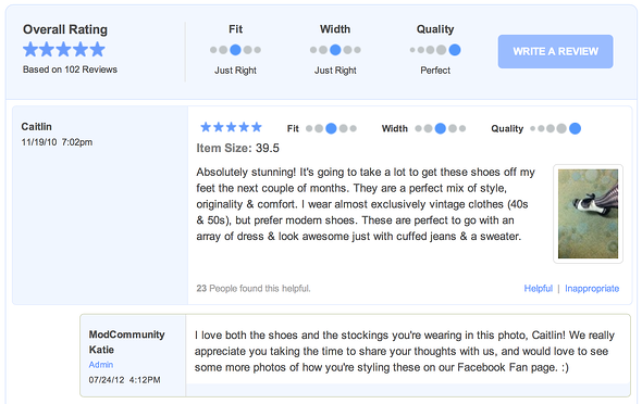
Various social media channels aren’t the only ways customers get to share their experiences. Located on each product page is a list of reviews for that particular item.
ModCloth doesn’t censor, either. For each less-than-stellar review, the customer service team reaches out with offers of assistance. Not only do the buyers get a chance to say exactly what they think, but ModCloth also uses that opportunity to improve customer delight.
Smart Email Marketing
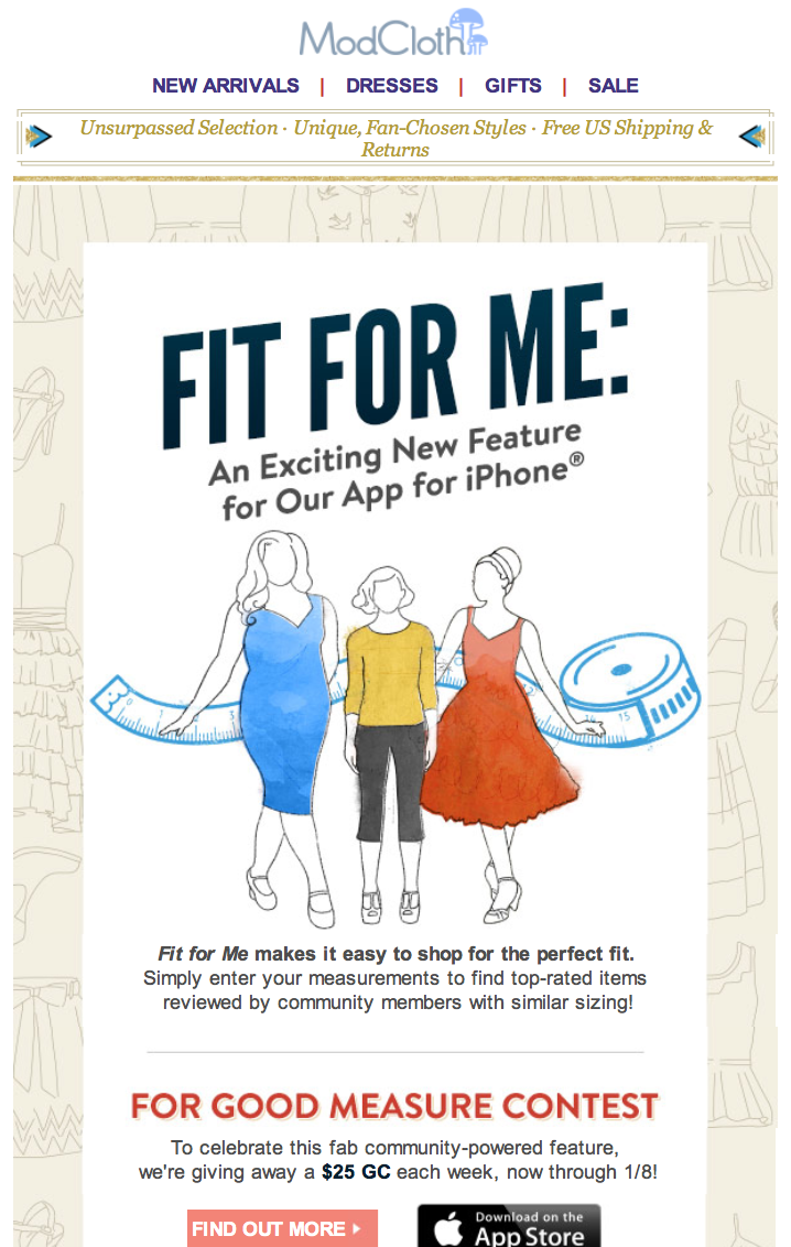
Sure, ModCloth sends out discounts for their most loyal customers, but they don’t simply rely on coupons to keep their email marketing on track. Check out this particular email that simply informs users of new features coming soon. What a great way to keep building a relationship between buyer and seller.
Email follow-ups for abandoned carts are just as effective. Images are used to remind the user what they almost purchased, and a fun subject line prompts a smile instead of a growl. Well done, ModCloth.
Responsive Design
Because so many purchases are made on mobile devices, responsive design is a must. Fortunately, my favorite commerce site also makes shopping on smartphones easy.
First, the menu is very easy to read, and there’s plenty of white space around the links to make clicking easy for thumbs.
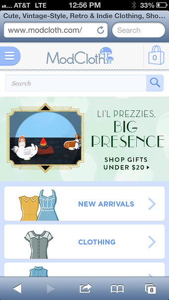
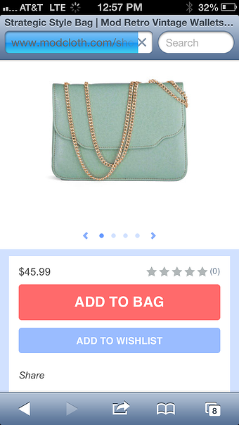
The images are quite large, and adding them to your cart just takes one click.
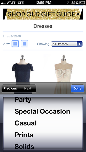
Even the filtering options are easy to use, meaning you can drill right down to the very thing you want to buy right there on your phone instead of having to wait until your laptop is in reach.
So, yeah. ModCloth’s ecommerce site is a veritable treasure trove of must-haves, and I’m not just talking about the cool clothes. If you’re looking for a role model, you could do much worse.